Measuring the Real Customer Experience of Our Frontend Stack
Categories
DevOps & SRE
At xMatters, we naturally want to give our users the best possible experience. That requires measuring customer experience. So instead of just using tools to simulate poor network/CPU conditions on our high-powered developer machines, we set out to get a better, more realistic view on how actual users were experiencing our SaaS offering.
Moving from Ad Hoc to Proactive Monitoring
To support this goal, we’ve moved away from tracking our frontend performance on an ad hoc basis (checking the bundle size, checking lighthouse scores and performance) to actively monitoring our site’s performance. We also want metrics so we can respond to and fix any severe performance degradations that we detect. The frontend is different from other services in terms of Service Level Objectives (SLOs) and Service Level Indicators (SLIs) because error rates and request latency only tell part of the story.
We started looking for a solution that would let us measure customer experience: proactively monitor the performance of our site, set thresholds for alerting on sustained poor performance, and establish SLOs around the average time it takes to load our site.
Welcome to the Real World, Kid
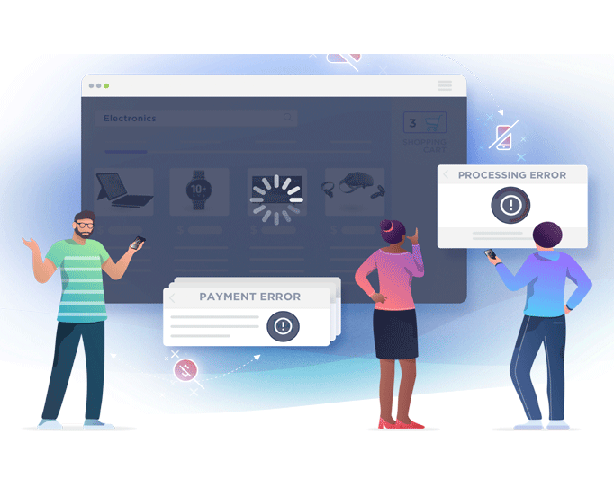
Measuring the performance of our frontend stack became a priority. As with any product—digital or physical—measuring performance in ‘lab conditions’ almost always gives a more optimistic outlook than what actual users experience. We’ve all seen it: from advertised internet provider download speeds to a picture of a burger you’re about to order, the ‘real thing’ is almost always less than what you get, even in the perfect conditions.
This is also important for xMatters, because while our developers have access to relatively powerful machines, our users access our services through variety of computers and browsers. Customers might use a company-supplied computer, or maybe they’re on their work laptop that needs some upgrades; and, maybe they’re on their company network with fiber speeds, or maybe they’re at home with spotty internet. All of these ‘maybes’ mean that any performance measurement done on our side (from a developer’s machine, or by automated tests in the CI) is an educated guess at best.
A Shot of RUM with an SRE Chaser
Unfortunately, you don’t provide excellence by educated guesses, and we needed to get insights on our real users’ experiences. This is called Real User Monitoring (RUM), where we receive telemetry about how users interact with our product, specifically with regards to performance.
In addition, we wanted to put these performance metrics in the context of a framework we already practice in xMatters: Site Reliability Engineering (SRE). In this context, we want to define SLIs, which give us a measurement of an aspect of our service (in this case the frontend) and then strive to keep them within our SLOs. We don’t need to go too deep into the details for this post — but suffice it to say we’ve found this approach works well for us and we wanted to put the performance of our frontend stack in this context as well.
Let the Toolquest Begin
Our previous solutions for monitoring performance all had various shortcomings. Google Analytics shows performance data, but it is sampled and therefore it’s difficult to get a good view of exactly what users are experiencing. Lighthouse is a great resource, but it only runs when you decide to run it and it doesn’t give any insight into your real-world users. Then there are the big application performance monitoring players like Dynatrace and New Relic, but we didn’t want to buy another pricey SaaS subscription when we already had many of the tools to solve the problem in our stack.
What worked for us was boomerang.js. It has already been battle-tested in many products and provides broad browser support and mostly hands-off integrations with today’s modern frontend architectures, using “NavigationTiming” API or falling back to more traditional methods when the API isn’t available. The beacons that boomerang (BOOMR) sends are then captured by fast-response server boomcatch which converts them into StatsD format for consumption across many services. (Our choice for consuming the StatsD payloads was SignalFX as we were already using it for other services.)
This made for a convenient setup, from which we could extract very granular data and be able to construct ‘bigger picture’ dashboards. This makes it possible to answer questions like “Did the latest release introduce a performance regression, and if so on which pages?”. That’s very powerful when it’s time to analyze our codebase.
Carefully Throwing boomerang.js
Using boomerang.js with our frontend stack was pretty straightforward, with no nasty gotchas. The trick here is to avoid the observer effect. If we loaded it naively (i.e., just like any other script), the boomerang script itself might affect our observations as it comes to 32kb minified which adds valuable milliseconds to our load time and skews the results. The IFRAME/Preload method mentioned in the boomerang documentation is a bit more tedious to set up and test but produces the best results when it comes to measurements.
After we set up our boomerang.js script, we’re ready to receive these performance beacons. But what do we do with them, and where do we store them? The beacons that BOOMR sends are simple XHR requests to a URL of your choosing, and you can do whatever you want with the data.
Using boomcatch and Data Mapping
Making sense of the payload that BOOMR sends might be a bit tricky, but fortunately the boomcatch project is there to help massage this data into some popular formats that you can use for analysis. boomcatch is a simple NodeJS server (a beacon receiver) that you can configure to run as a part of the RUM stack.
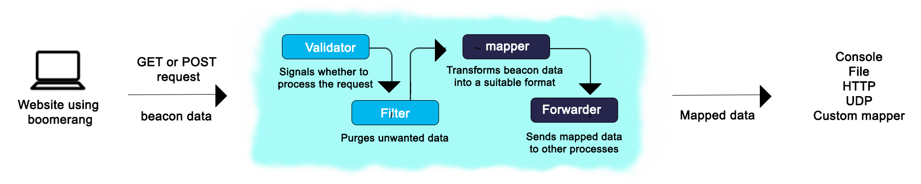
Monitoring the RUM stack
In essence, it will collect the timing and performance data from the client and forward it to a database (in our case, SignalFX). boomcatch has several available mappers, but the one we needed was the StatsD mapper. This converts the beacon data that comes in as a JSON payload into a format that can be ingested by SignalFX:
<metric name>:<value>|<type>
Metric names are the different metrics that BOOMR can send, like full page load time, or time taken to load a part of the page after an interaction. These get translated to “latency” or “gauge” data types for grouping and analysis.
Add Visualization for Trendspotting
Initially, our focus was on the “spa” and “spa_hard” values, which come from the boomerang.js SPA plugin and measure the time it takes to fully load the UI and for the first network calls to resolve. These are the most important metrics for measuring how fast your users can truly reach your page and start interacting with or seeing meaningful content. Basing our approach around these metrics, we created dashboards to report trends over a 30-day window, and added line charts for visualization along with the SLI numbers that we care about.
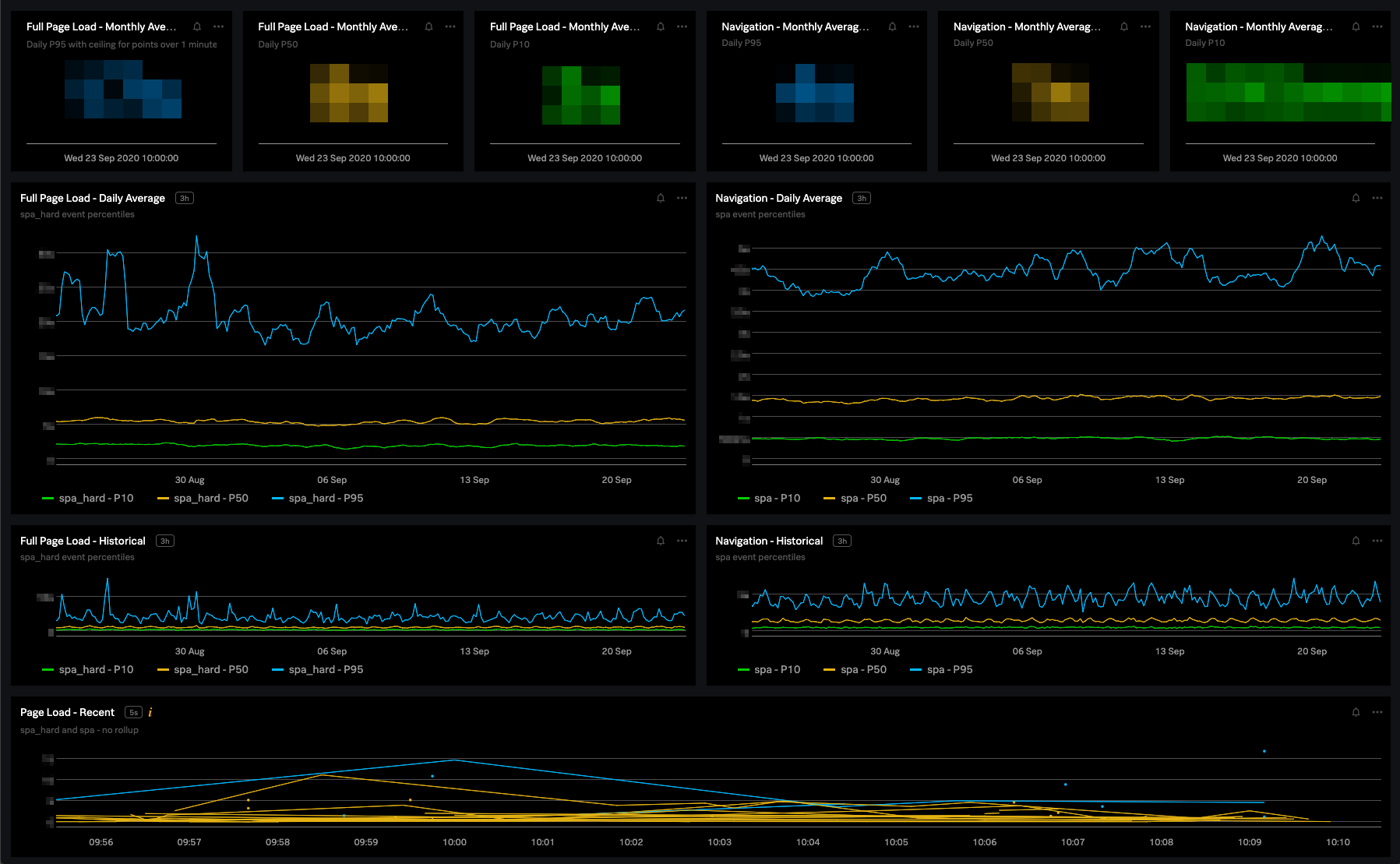
One of our dashboards for tracking page performance
Gather Historical Data for Goal-Setting Context
Once we’ve set up our stack and started receiving performance metrics from real users, and can somehow query this data, it’s time to set some goals. But how can we tell what a good goal is? Is a 300ms improvement on “spa_hard” good? Well, it depends entirely on how long it currently takes. If it’s taking on the order of tens of seconds, 300ms is probably not an optimization that you want to spend a lot of time re-architecting parts of your system for. On the other hand, if you’re already in the sub-second load times (rare) then it might be a huge accomplishment.
So, we need some context before we start setting goals; we need historical data. That means the next step is… to do nothing. Let’s collect some data first to inform our decisions and help us set goals for where we want to go in the future. In our case, we collected about 6 weeks’ worth of data on the xMatters product before starting to formulate next steps.
Defining Meaningful SLOs
Once we have the historical data, we can start making informed decisions, and drive our goals with it. Since the aim is to tie this into our SRE practices, now is a good time to start thinking about our SLIs as they pertain to the frontend. One obvious thing we see looking at our historical data is that it’s not flat! Our performance metrics like “spa” and “spa_hard” also depend on network requests, which ties us to the backend performance on some level. So, we saw a cyclical pattern in these metrics, where performance slightly dropped during weekdays and working hours, and increased at nighttime and on the weekends—save for the occasional client incident, which happen randomly, and is when our customers need us the most.
Taking this into account, we defined our two main SLOs as tied to the “spa” and “spa_hard” values. These are valuable because instead of artificial performance measurements and those that only are concerned with the UI, these take into account network requests as well. This means we can get greater insight into how soon users can really interact with the UI. (Often, the problem with measurements such as “First Contentful Paint” or “First Meaningful Paint” can be misleading, as they might mistakenly count loading pages or spinners as the UI having loaded.)
Build-In Flexibility and Track Performance
We defined these metrics as the average over a sliding window of 30 days divided into percentiles; for example, “ms latency for 95th Percentile Averaged over 30 Days”. This gives us the flexibility to catch any “spikes” and prevent regression spreading. It also provides a range where we can be confident that this is what users actually experience. Some of the SLOs we arrived at were:
- 95% Percentile Average 30 Days <= X ms
- 50% Percentile Average 30 Days <= Y ms
- 10% Percentile Average 30 Days <= Z ms
The objective is to keep these metrics below the proscribed amount of time. Defining them this way, we can progressively tighten and fine tune these constraints in the future and track our progress in improving the performance of our frontend stack. One thing to note is how naturally the objectives follow from the indicators. We know we are tracking what matters and setting our goals in those terms, which are informed by real data and not some gut feeling.
We also set some other SLOs that revolve around bundle sizes and the percentage of unhandled errors, which we track in other ways.
Harsh Truths
At this point we needed to face some harsh truths! Just like my home internet and that tempting fast food menu, our frontend speeds were not as advertised. Developing with Chrome CPU Throttling only goes so far here, as “the UI” is more than just how fast your JavaScript code runs. It’s a combination of code speed and network requests and latency and so on. It might be tempting to dismiss these as the problem for the other services, but the reality is that the user doesn’t care. If it’s taking way too long to load a page, it doesn’t matter whether it’s because the JS is slow, it makes too many network requests, or because of dodgy internet; from the user’s perspective, it’s just slow.
Time for a UI/UX Rethink
This might seem like someone else’s problem, but confronting these facts let us think about our approach to UI/UX. As with most things, it turns out that honesty and a data-driven approach yields the best results for iteration, both from a code-centric point of view, but also from the UX perspective. How are we handling loading states, confirmations, and errors? What do we load in pages that might really be secondary or non-essential to the page’s primary purpose? Thinking about these things informs our long-term project strategy much better and with sharper clarity.
xMatters + SignalFX = Regression Suppression
One immediate gain here was that it’s now very easy to see major performance regressions on a release-by-release basis. We deploy code and release very frequently, so being notified of regressions as soon as we can detect them is paramount for handling them before they get out of hand and affect customers. What do we use to manage these types of incidents for our “Frontend Service?” xMatters, of course! With the xMatters and SignalFX integration, getting notified about regressions is a breeze.
Real Measurements Yield Real Results – and a Bonus
Our new monitoring system has given us the knowledge we need to move forward and continually improve the frontend performance of our app. We’re refining our methods and metrics as we go and seeing some very real benefits from implementing RUM and tying it to SRE practices. This keeps our teams focused on what matters the most – customer experience – and gives us a reliable way to make decisions about where we’re taking the technology in terms of the front end.
One unexpected advantage of this project was that it helped give the frontend stack more legitimacy. Often in backend-heavy products, the frontend can seem like an afterthought because there are no servers to monitor for mostly static setups. By taking the performance into consideration, we’ve started seeing how the frontend can also be thought of as a service with costs and tradeoffs that impact the customer’s journey and experience.
Try xMatters and see how we take measuring customer experience more seriously than anyone else.
xMatters Engineering manager Peter Kosa contributed to this article.